FreeQAs
 Request Exam  Contact
  • Home
  • View All Exams
  • New QA's
  • Upload
PRACTICE EXAMS:
  • Oracle
  • Fortinet
  • Juniper
  • Microsoft
  • Cisco
  • Citrix
  • CompTIA
  • VMware
  • ISC
  • SAP
  • EMC
  • PMI
  • HP
  • Salesforce
  • Other
  • Oracle
    Oracle
  • Fortinet
    Fortinet
  • Juniper
    Juniper
  • Microsoft
    Microsoft
  • Cisco
    Cisco
  • Citrix
    Citrix
  • CompTIA
    CompTIA
  • VMware
    VMware
  • ISC
    ISC
  • SAP
    SAP
  • EMC
    EMC
  • PMI
    PMI
  • HP
    HP
  • Salesforce
    Salesforce
  1. Home
  2. Tableau Certification
  3. TDA-C01 Exam
  4. Tableau.TDA-C01.v2024-10-14.q121 Dumps
  • «
  • 1
  • 2
  • 3
  • 4
  • 5
  • 6
  • 7
  • 8
  • 9
  • 10
  • …
  • »
  • »»
Download Now

Question 11

You need to change the values of a dimension without creating a new field.
What should you do?

Correct Answer: C
You can create aliases for the members of a dimension by right-clicking the dimension in the Data pane or in the view and selecting Aliases. This changes how the values are displayed in the view, but not the underlying data. For example, you can create an alias for "Central" as "Midwest".
insert code

Question 12

In a worksheet, you have a calculated column named YTD Sales that uses the following formula.
[Order Date] <= TODAY () AND DATETBUNC {"year", [Order Dace]) = DATETPUNC)"year", TODAY(J) You want to create a calculated column named Exclude Current Month that will be dragged to the Filters shell. Exclude Current Month will exclude the current month values from YTD Sales.
How should you complete the formula for Exclude Current Month? (Drag the appropriate Options to the Answer Area and drop into the correct locations.)

Correct Answer:
insert code

Question 13

You have the following bar chart.

You want the chart to appear as shown in the Mowing exhibit.

What should you add?

Correct Answer: B
A reference line is used in Tableau to display a line at a constant value or a computed value such as an average, median, minimum, or maximum in a bar chart. In this case, adding a reference line would allow you to show the median, upper quartile, and lower quartile, which corresponds to the changes shown in the bar chart.
insert code

Question 14

Open the link to Book1 found on the desktop. Open the sales dashboard.
Add the Sales by State sheet in a Show/Hide button to the right side of the dashboard.

Correct Answer:
check the steps below in explanation.
Explanation:
To add the Sales by State sheet in a Show/Hide button to the right side of the dashboard, you need to do the following steps:
Open the link to Book1 found on the desktop. This will open the Tableau workbook that contains the sales dashboard.
Click on the sales dashboard tab at the bottom of the workbook to open the dashboard. You will see a dashboard that shows various charts and filters related to sales data.
Drag Sales by State from the Sheets pane to the right side of the dashboard. This will add the sheet as a floating element on the dashboard. You can resize and position it as you like.
Right-click on Sales by State and select Add Show/Hide Button from the menu. This will add a button that allows you to show or hide the sheet on the dashboard. You can customize the appearance and behavior of the button by clicking on it and using the options on the Marks card.
Optionally, you can drag a vertical layout container from the Objects pane to the right side of the dashboard and place Sales by State and its button inside it. This will help you organize your dashboard elements and align them neatly.
References: https://help.tableau.com/current/pro/desktop/en-us/dashboards.htm
https://help.tableau.com/current/pro/desktop/en-us/dashboards_showhide.htm
https://help.tableau.com/current/pro/desktop/en-us/dashboards_create_layouts.htm
insert code

Question 15

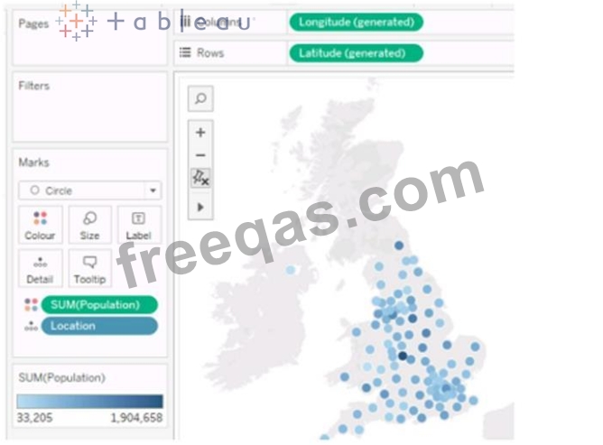
You have the following Map.

You need the map to appear as shown in the following visualization.

What should you do?

Correct Answer: D
To create a map visualization that shows the concentration of data points in different locations, you need to change the mark type to Density. This will create a heatmap that uses color and size to indicate the density of the data points. You can also adjust the intensity and transparency of the density marks to suit your needs. References: The information is based on the following sources:
Create Heatmaps that Show Trends or Density in Tableau
Build a Simple Map - Tableau
insert code
  • «
  • 1
  • 2
  • 3
  • 4
  • 5
  • 6
  • 7
  • 8
  • 9
  • 10
  • …
  • »
  • »»
[×]

Download PDF File

Enter your email address to download Tableau.TDA-C01.v2024-10-14.q121 Dumps

Email:

FreeQAs

Our website provides the Largest and the most Latest vendors Certification Exam materials around the world.

Using dumps we provide to Pass the Exam, we has the Valid Dumps with passing guranteed just which you need.

  • DMCA
  • About
  • Contact Us
  • Privacy Policy
  • Terms & Conditions
©2026 FreeQAs

www.freeqas.com materials do not contain actual questions and answers from Cisco's certification exams.