FreeQAs
 Request Exam  Contact
  • Home
  • View All Exams
  • New QA's
  • Upload
PRACTICE EXAMS:
  • Oracle
  • Fortinet
  • Juniper
  • Microsoft
  • Cisco
  • Citrix
  • CompTIA
  • VMware
  • ISC
  • SAP
  • EMC
  • PMI
  • HP
  • Salesforce
  • Other
  • Oracle
    Oracle
  • Fortinet
    Fortinet
  • Juniper
    Juniper
  • Microsoft
    Microsoft
  • Cisco
    Cisco
  • Citrix
    Citrix
  • CompTIA
    CompTIA
  • VMware
    VMware
  • ISC
    ISC
  • SAP
    SAP
  • EMC
    EMC
  • PMI
    PMI
  • HP
    HP
  • Salesforce
    Salesforce
  1. Home
  2. Tableau Certification
  3. Desktop-Specialist Exam
  4. Tableau.Desktop-Specialist.v2026-05-03.q171 Dumps
  • ««
  • «
  • …
  • 14
  • 15
  • 16
  • 17
  • 18
  • 19
  • 20
  • 21
  • 22
  • 23
  • …
  • »
  • »»
Download Now

Question 86

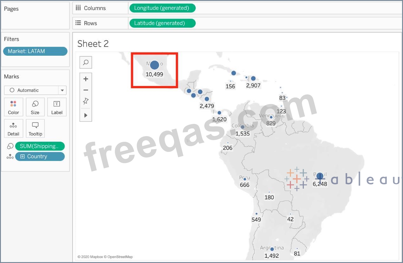
Using the dataset, plot a Map showing all the countries, filtered by Market to only include LATAM. Which country in the LATAM Market has the highest shipping delay (sum of total number of days between the order date and the ship date)?

Correct Answer: D
Explanation
VERY IMPORTANT QUESTION FOR THE EXAM, PAY ATTENTION
1) To find the number of days between order date and shipping date, we will make use of a calculated field:

In the data pane, click on the dropdown arrow, and choose create calculated field.
Let's name this calculated field "ShippingDelay" (you can name it anything you want :) )
2) Use the DATEDIFF() function, and pass it the arguments as follows:

'day' depicts that we want to calculate the number of DAYS between the two dates. The first argument is
'start_date' which is the ORDER_DATE (day the order was placed), the second argument is 'end_date', which is the SHIP_DATE (date the order was shipped). So by subtracting as follows: SHIP_DATE - ORDER_DATE, we can find the delay in shipping.
Click OK.
3) You should now have a new measure as follows:

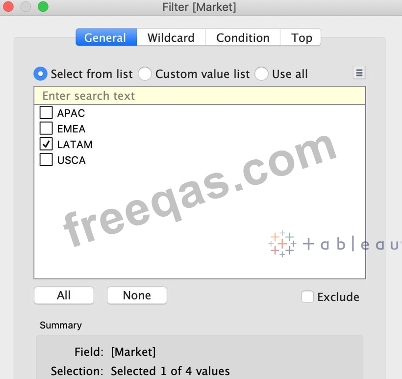
4) Phew! The hard part is done! Now let's filter by Market to include only LATAM:

5) Drag Country to the view, and the new calculated field 'ShippingDelay' to SIZE on the Marks Shelf as follows:
*You can also click on Show Text Labels to be sure that you're choosing the Largest value*

Clearly, Mexico has the highest Shipping Delay!
insert code

Question 87

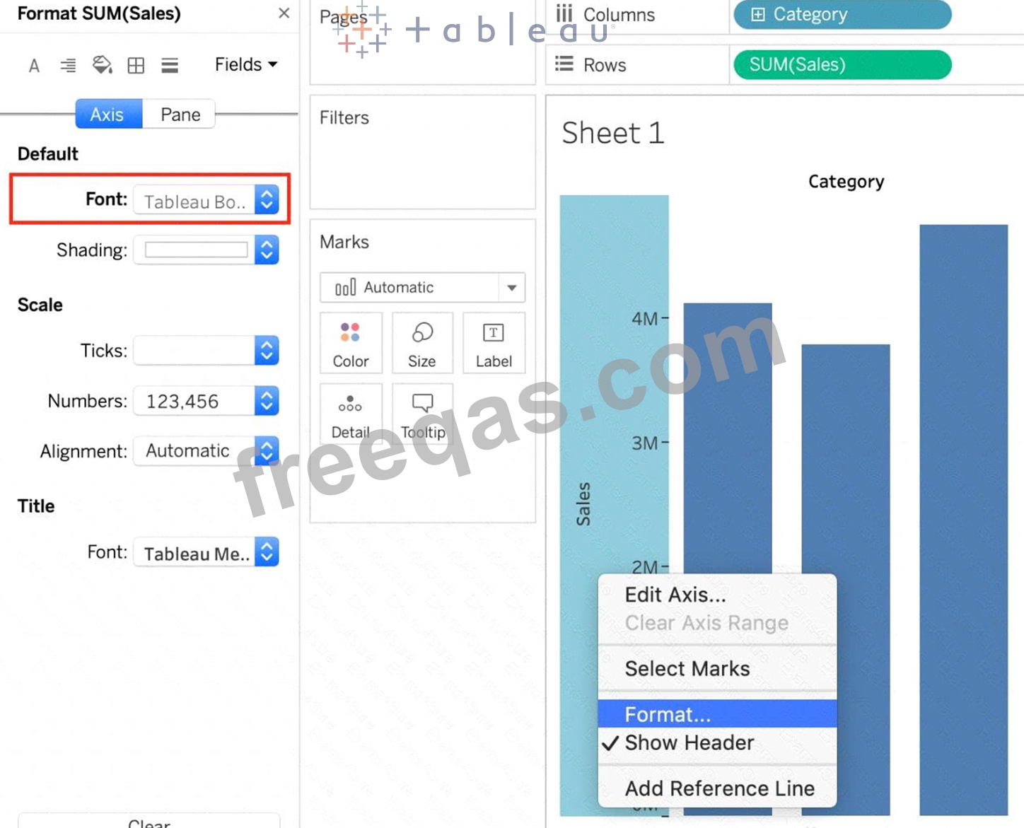
How can you format an axis as Bold in Tableau?
Correct Answer: C
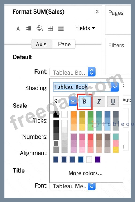
To make an axis bold, simply right click it, select format, and then click on Font to choose Bold:

None of the other options are valid ways to make the axis bold.

Read more about editing axis: https://help.tableau.com/current/pro/desktop/en-us/formatting_editaxes.htm
insert code

Question 88

Which of the following is NOT a new feature introduced in Tableau 2020.1?
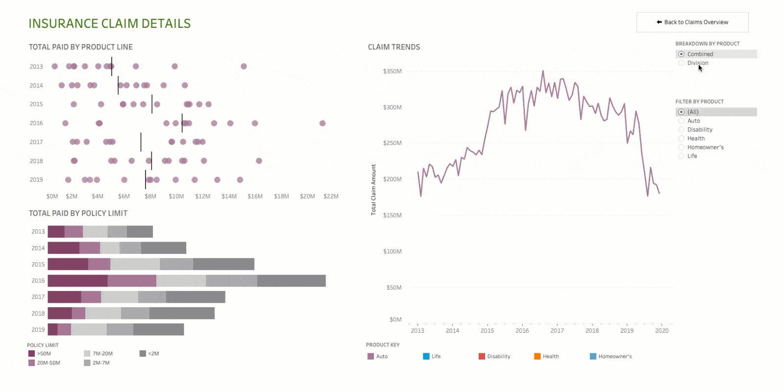
Correct Answer: D
Explanation
Your Tableau Desktop Specialist exam will be based on the 2020.1 version.
Set controls are a new feature introduced in the 2020.2 version, and hence is the correct answer - it is not a part of 2020.1 For the 2020.1 version the new features were:
1) Viz animations:
Viz animations help you see and understand your changing data. It's easy to track the logical steps behind data's evolution and tell powerful data stories. Sorting, filtering, adding fields, and other actions will now smoothly animate your visualizations. Choose whether to turn Viz Animations on or off, and decide how you'd best like to apply animations to your new workbooks.

2) Dynamic Parameters:
Say goodbye to republishing workbooks with parameters every time the underlying data changes. Set your parameter once, and Tableau will automatically update the parameter's list of values every time someone opens the workbook.

3) Buffer Calculations:

Buffer calculations allow you to visualize the distance around point locations. Give Tableau three parameters-location, distance, and a unit of measure-and a buffer, or boundary is instantly created.
Answering complex spatial questions becomes easier than ever before-visualize what properties are within
200 meters of a proposed transit site, or how many competitors' stores are within 1 mile of their store, and more.
insert code

Question 89

True or False: A sheet cannot be used within a story directly. Either sheets should be used within a dashboard, or a dashboard should be used within a story.

Correct Answer: B
Explanation
It is possible in Tableau to use a sheet within a story directly.
Moreover, in Tableau, a story is a sequence of visualizations that work together to convey information. You can create stories to tell a data narrative, provide context, demonstrate how decisions relate to outcomes, or to simply make a compelling case.
At the same time, a story is also a collection of sheets, arranged in a sequence. Each individual sheet in a story is called a story point.
insert code

Question 90

In Tree maps, the size begins with the largest rectangle on the ________________ and the smallest rectangle on the ________________.

Correct Answer: C
Tree maps size begins from maximum in top left to smallest in bottom right.

See below to learn how to create a TreeMap and add colours to it:
insert code
  • ««
  • «
  • …
  • 14
  • 15
  • 16
  • 17
  • 18
  • 19
  • 20
  • 21
  • 22
  • 23
  • …
  • »
  • »»
[×]

Download PDF File

Enter your email address to download Tableau.Desktop-Specialist.v2026-05-03.q171 Dumps

Email:

FreeQAs

Our website provides the Largest and the most Latest vendors Certification Exam materials around the world.

Using dumps we provide to Pass the Exam, we has the Valid Dumps with passing guranteed just which you need.

  • DMCA
  • About
  • Contact Us
  • Privacy Policy
  • Terms & Conditions
©2026 FreeQAs

www.freeqas.com materials do not contain actual questions and answers from Cisco's certification exams.